Panacea Biotec Case study
(website, healthcare, branding)
The objective of this project was to redesign the company's website to reflect their updated brand values and enhance content delivery, aiming to strengthen their competitive position in the market
What tools did I use?
Figma, canva, Icounscout, Illustrator
What?
What exactly is the problem?
The complex information architecture of the current site is not user focused
The current version of the website lacks a structured content layout, making it difficult to navigate and thus, limiting its functionality. Additionally, it does not reflect the updated brand values and vision of the company. These issues have been causing a negative impact on their competitive edge in the market.
Problem statement
How might I incorporate the brands new identity and make the design more intuitive and scalable while still maintaining familiarity
Who?
Whose problem are we solving?
The business and their consumers
How?..
UX research
Our team conducted a mix of stakeholder/user interviews along with two sessions of card sorting over 2 weeks, which led me to identify the primary areas of weakness.
No understanding of colour psychology
All successful brands have a color attached to them which Panacea lacked and this was impacting it’s ability to be set apart from it’s competitors
Too much information all of a sudden is overwhelming to the user. It can cause confusion, frustration, and ultimately drive users away from the site, which is what was happening here
Too many options in the navigation menu
The disorganised information architecture was hindering users' ability to perform tasks efficiently, which was preventing users from easily accessing critical healthcare information and resources from Panacea’s website.
Difficult navigation
The inconsistent design elements were causing confusion among users. The lack of uniformity disrupted the user experience, making it difficult for users to navigate and trust the interface.
Complicated UI

Few sketches to test out the new re-design

Card sorting to figure out the IA
Mind mapping to figure out the design
My takeaway from the research
I need to reorganise the content to ensure it doesn't overwhelm users, while making the UI personalised and intuitive to foster a strong connection with them
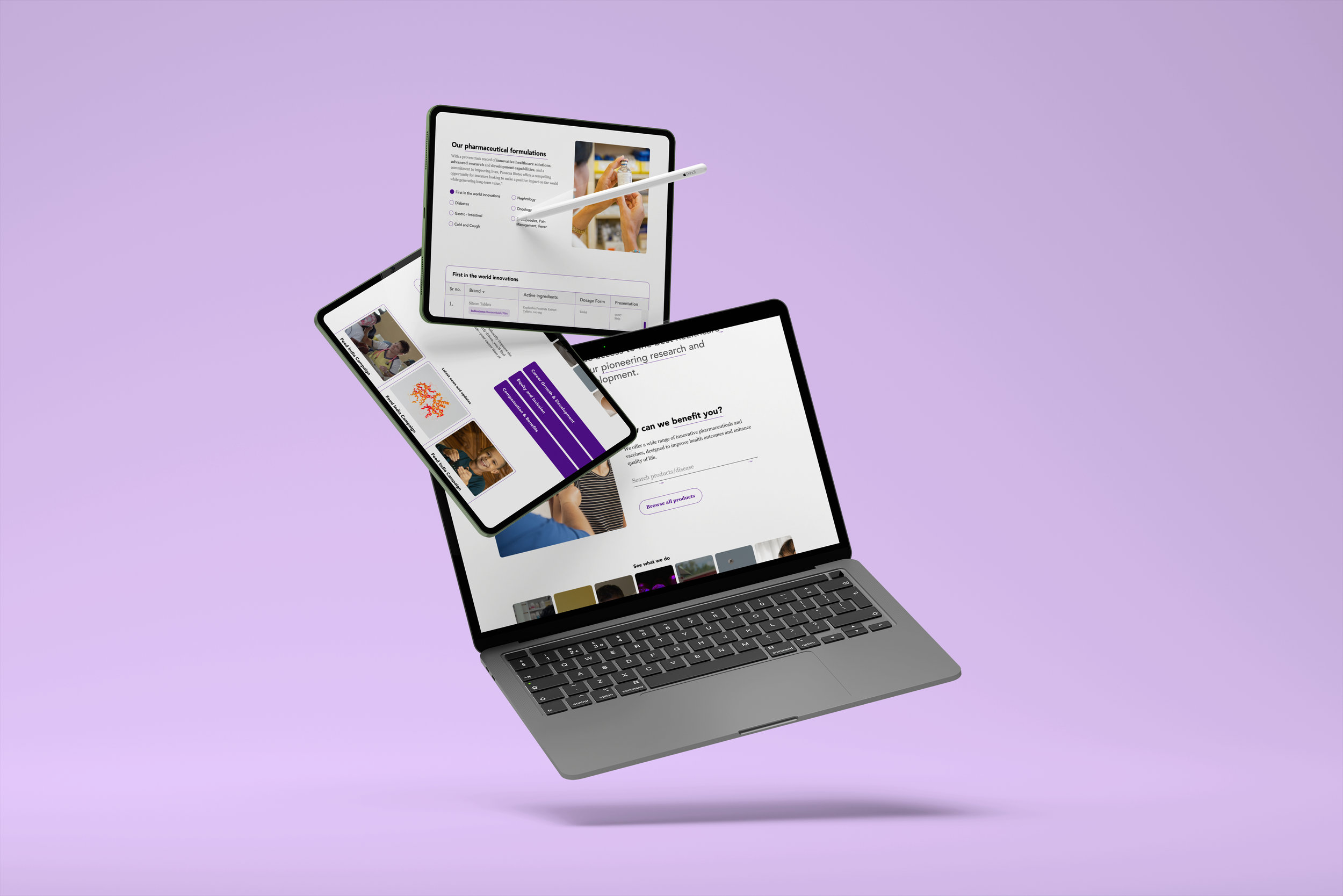
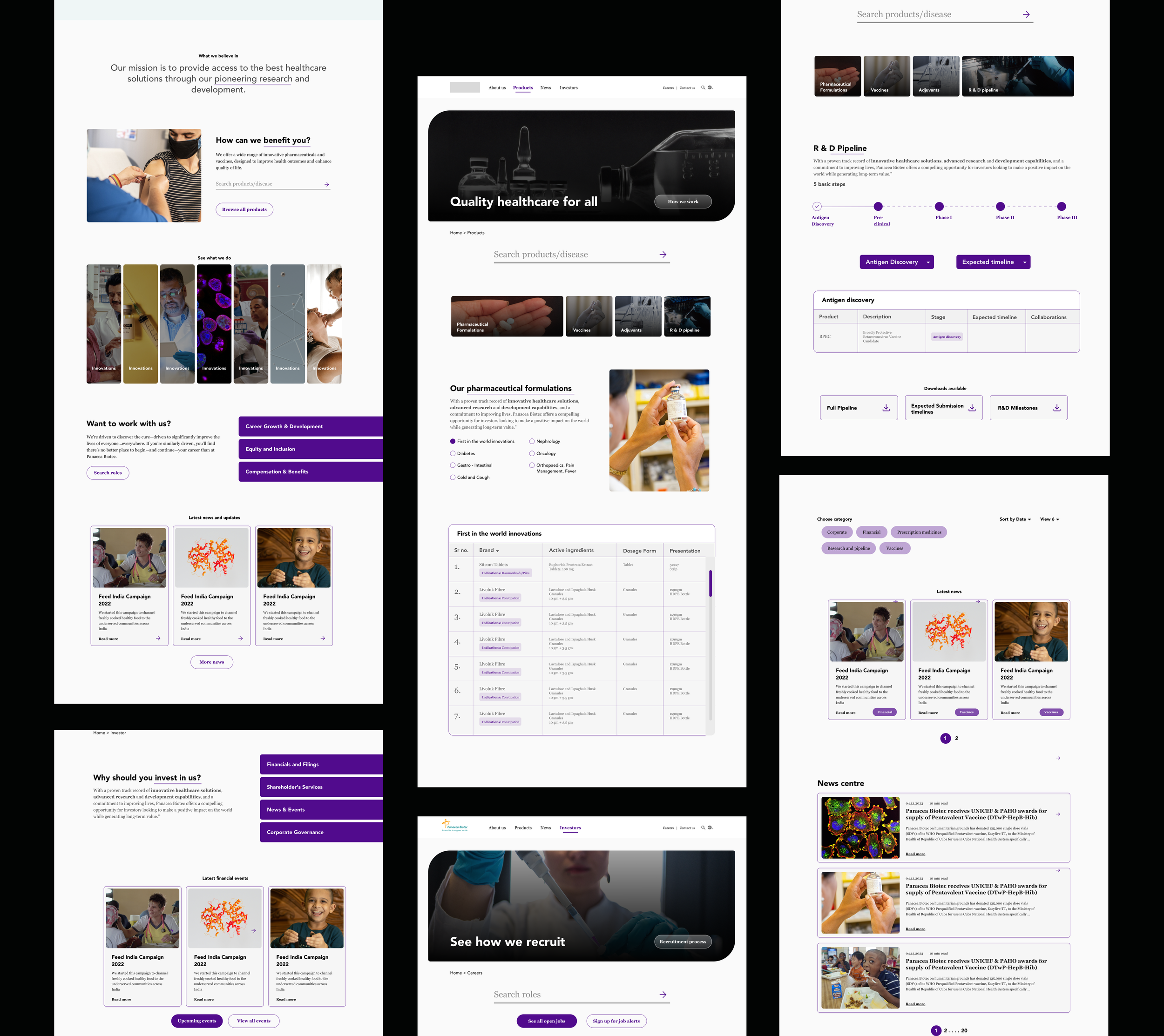
Solution
Panacea Biotec’s newly redesigned website emphasises trust, credibility, and a unique connection with users.
The interface is built to provide intuitive navigation to help users easily achieve their goals. The goal was to not only enhance user satisfaction but also reinforce the brand's distinct identity.
Decluttering the home section
In my redesign, I focused on highlighting the most important details on the home page while removing excess information that could potentially distract or confuse users. The goal was to create a more streamlined and user-friendly interface that prioritizes the essential content, allowing users to quickly and easily find the information they are seeking
The original website presented a significant amount of information in a scattered manner, which was overwhelming the users and hindering their ability to find the most relevant information.
Adding CTA buttons
Call to action buttons help bring focus to the users' attention, making it easier for them to navigate and interact with the website. Moreover, they can help track and analyse user behaviour to measure success
Creating a design system
I created and implemented a new color and style system across the design to enhance user navigation and overall usability.
Adding a search bar
This addition may seem small but is actually a game changer for streamlining navigation.
Something extra
A few things that I wanted to modify but did not make it in the final redesign
Adding drop-downs to the products section
01
Users had to scroll through the entire page to locate the section of their interest, which was frustrating and time-consuming, especially for people who were only interested in a particular topic. Which is why I wanted to display all the sections at the top of the page. This would allow users to quickly see how many sections are available and choose the one that interests them the most, giving them a sense of control and efficiency in navigating the website.
The original website displayed different tables for various sections without providing a clear overview which was confusing.
Adding personal stories
02
To further engage users and substantiate the benefits of working with Panacea, I wanted to include compelling stories or testimonials from current employees in the career section
Their positive experiences could serve as powerful endorsements and help create an emotional connection with potential candidates
What did I learn?
While some proposed modifications did not make it into the final redesign, this taught me the importance of flexibility and being open to iterative improvements based on user feedback and project constraints.
Flexibility and adaption
Developing a new color and style system taught me the significance of consistency in design. A cohesive visual identity not only enhances usability but also strengthens brand recognition and trust.
Value of Consistency