Markit Case study
(mobile app, iOS, prototyping)
A redesign project aiming to enhance the user experience and enable retailers and business owners to connect with each other more seamlessly
What tools did I use?
Figma, Behance, Icounscout, photoshop
What?
What exactly is the problem?
The app lacked a reliable UX causing users abandon it quickly
The current version of the app lacks a clear design system, making it unintuitive and inconsistent. This causes a lot of frustration among users. Additionally, the app is too complex and time-consuming to navigate, leading to a significant loss in engagement and revenue.
Problem statement
How may I redesign the application to improve Markit’s user experience in order to increase engagement and user satisfaction
Who?
Whose problem are we solving?
Wholesalers and small businesses
Photo by CardMapr.nl on UnsplashPhoto by CardMapr.nl on UnsplashHow?..
01
Primary research
Research methods
What methods of UX research did I use to understand the problem better and find a solution?
I wanted to figure out the common UI patterns in similar applications
My initial approach to this problem was to conduct a UX audit of common UI patterns in similar B2B apps, identifying which features are essential, which can be omitted, and which are considered a gift from god
02
Usability testing
The goal of this test was to figure out the roadblocks in the current version
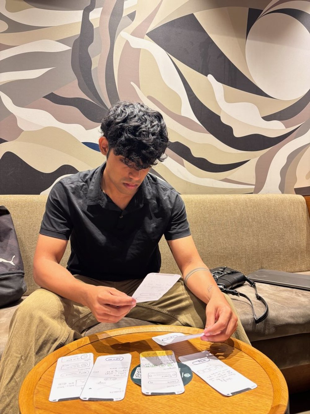
I conducted a usability testing session to identify the main pain points users encounter while navigating the app
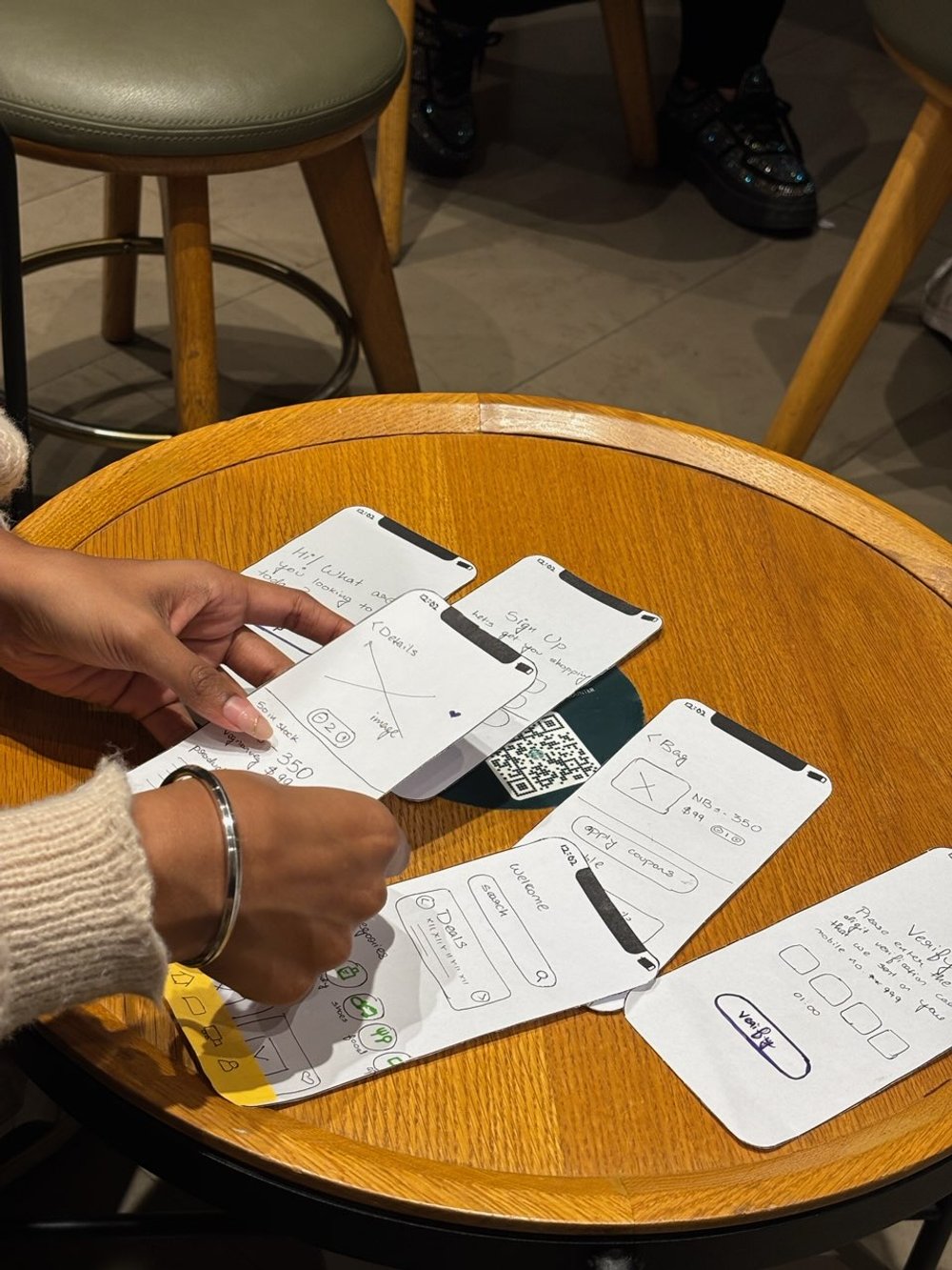
I conducted usability testing by splitting participants into two groups, each assigned different tasks to complete within a set time limit, using paper prototypes to simulate the interface. Only 30% successfully completed their tasks on time, 20% abandoned the test midway, and approximately 50% struggled to find what they needed. The use of paper prototypes allowed participants to provide detailed feedback on interface layout and functionality. Following the test, I interviewed participants to pinpoint their frustrations and explore ways to address these issues.
My takeaway from the research
If I design an user friendly interface that facilitates connections between buyers and sellers and offers real-time inventory updates it will strengthen user - system relationship and improve overall business performance
How am I going to address the pain points?
Buyers don’t know who they are purchasing the product from (and vice versa)
By having a verification system for businesses/wholesellers, I hope to ensure trust and authenticity
Users are not able to make informed purchasing decisions
By providing users with custom recommendations and real time updates I hope to increase user engagement
Inconsistent design elements are leading to confusion
By following consistent and intuitive UI, I hope to give the users a frictionless experience
Solution
Design an app update to enhance functionality and user satisfaction by ensuring security, live status tracking, and personalised recommendations within a well-organised interface.
Using a design system
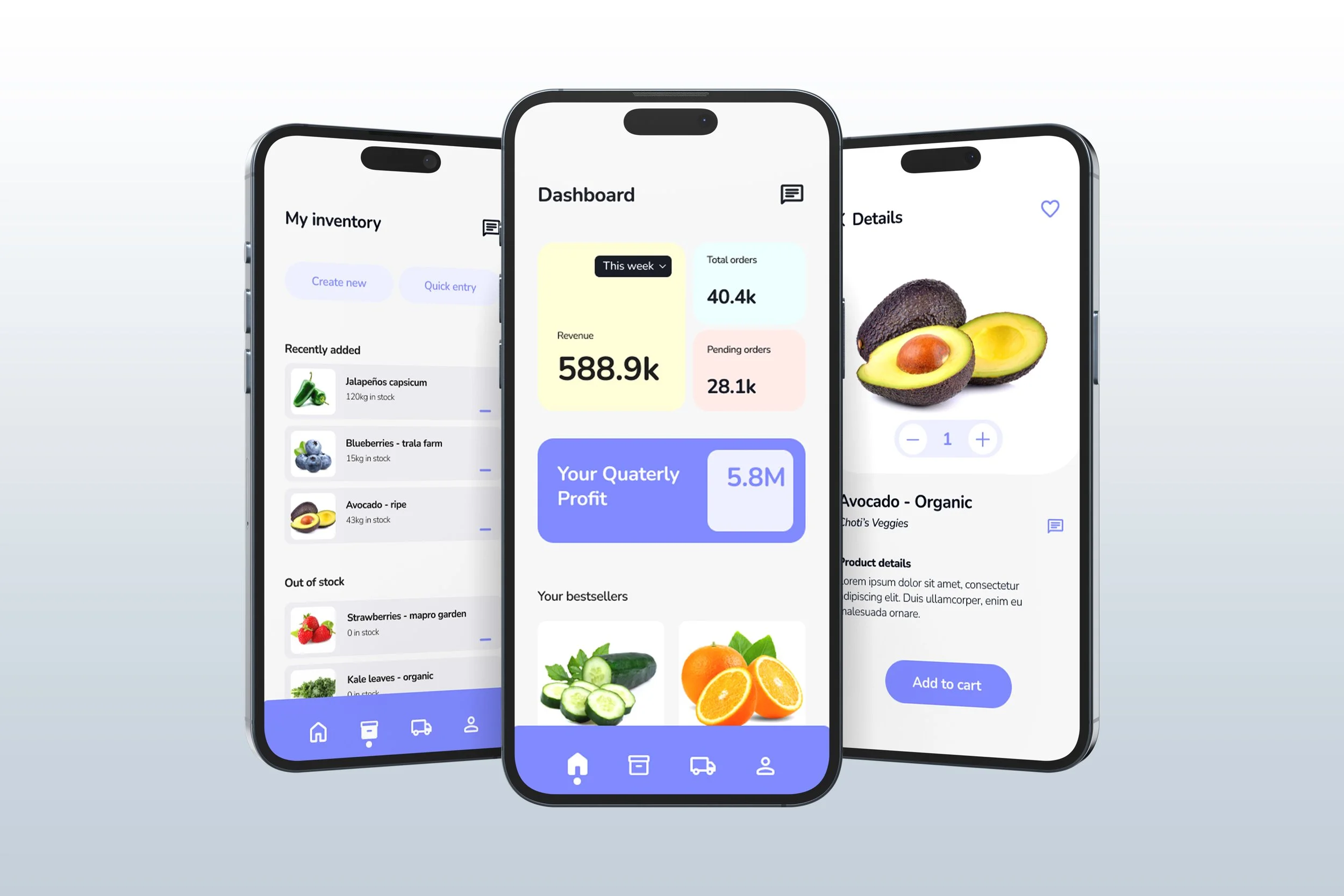
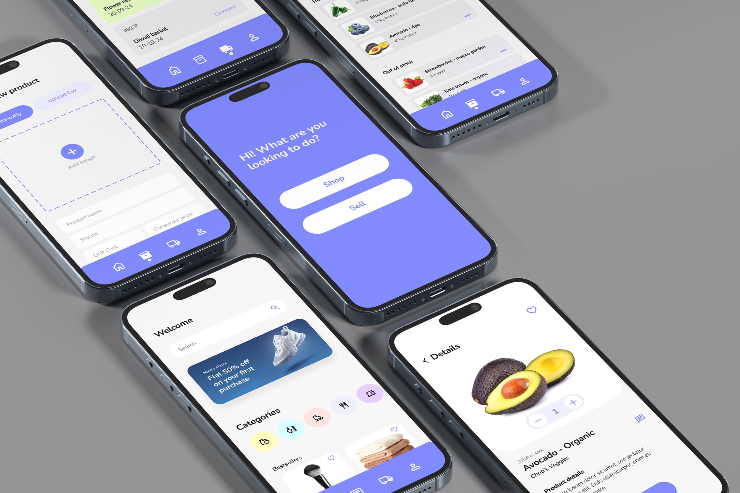
I established foundational guidelines which were the key to my design process throughout this project. This strong base ensured uniformity, scalability, and usability, thereby reducing the learning curve and making the app easier to use.
Organsing things for easier access to information
The first thing I noticed when using the app was the overwhelming amount of information in one place, which was quite distracting. Implementing a dashboard to organize all the important info made the app much easier to use.
Getting real - time updates
Knowing the status of their order would provide users the reassurance and trust they need. Additionally, real-time inventory updates would prevent the risk of over-ordering and stockouts
Communicating with your buyer/seller
I designed a messaging system within the app so the users would be able to easily discuss products, resolve issues and negotiate terms amongst each other, ensuring efficient communication.
Details? Yes please
Whether it was a business profile or a product listing, I made sure that users had access to in-depth information to everything to help them make better purchasing decisions and increase their satisfaction.
What did I learn?
That I had a lot to learn
This was my first major project as a new self-taught designer, and I realised JUST how different designing in the real world actually was compared to what I learned online.
I spent a lot of personal time on this project and was SO confused and scared, luckily my manager was kind enough to answer all my questions (plus my brain kinda rocks). In the end I was really proud of how this turned out!
